The first version of SwiftStarterKits shipped without a dedicated product page. Upon landing on the website, you'd see some basic information about the business, followed by a section which gave a walkthrough of our single product. At the bottom of the section, a "learn more" button exists, which links directly to the Stripe store page. This was enough for version 1.0.0, I think, but ultimately limits product upsell opportunities and copy experimentation. So we built out a dynamic product page which leaves some room to grow alongside our products.
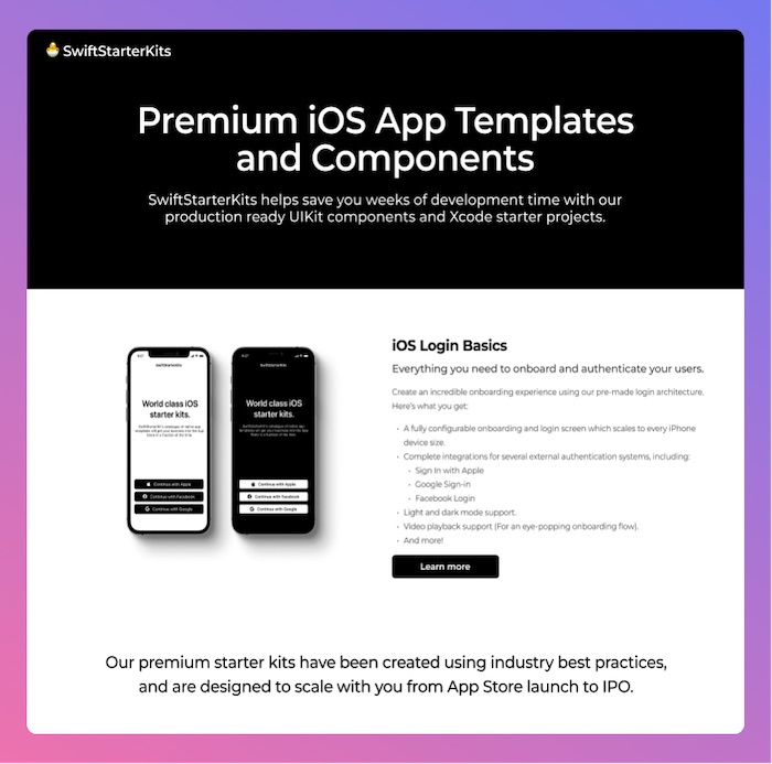
Here's what the home page looked like before:

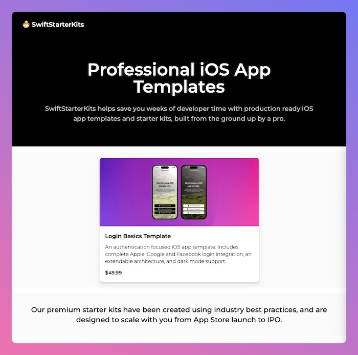
Here's what the home page looks like now:

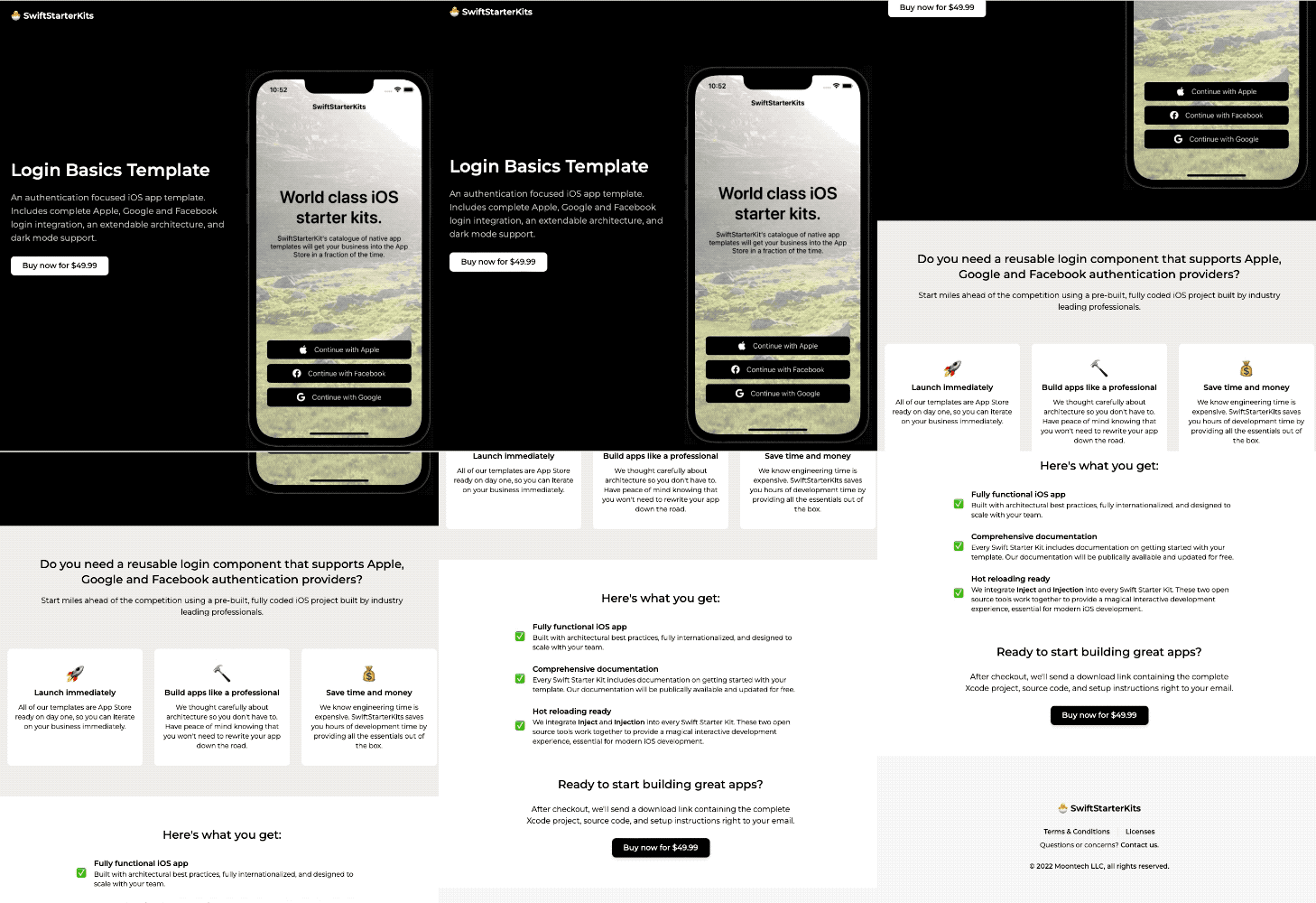
Here's a look at the brand new SwiftStarterKits Login Basics product page:

Some problems that I hope this solves:
- A more cohesive landing page experience, that can introduce the SwiftStarterKits business as a whole while giving overviews of individual products (Rather than everything, all at once).
- Focused web pages for each product, which provide room to describe templates in detail, embed a gallery of all included screens, include a list of features and infrastructure that comes with a purchase. Additionally, allowing for room to grow and experiment with other aspects of optimizing an upsell funnel.
The product page is implemented as a dynamic HTML template, which renders on the server via dynamic product data structures. This modeling allows for a nice "view model" esque collection of the static data pertaining to each product (Like title, description, price, Stripe store page URL, S3 download url, etc).
While not strictly necessary at this stage, I wanted to do some upfront engineering work to ensure all the disparate bits of information relating to a template has a single source of truth (not all of which live on the server). The next template we release will merely need a dedicated product object alongside the in-memory list of products, and a new home page gallery item + product page will render automagically.
